How to Use Stylistic Alternates Without Hurting Legibility
Stylistic alternates can give a familiar word a distinctive voice, but too many substitutions can slow recognition. Learn how to choose and test alternates with restraint.
 Written by HiveGlyph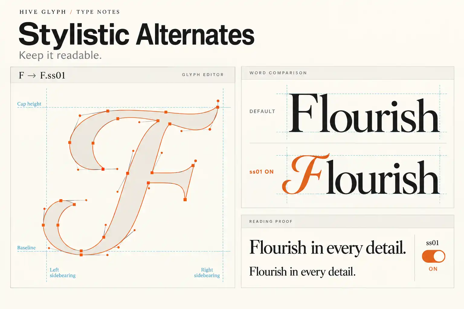
Stylistic alternates are easy to love in a glyph panel. A familiar letter suddenly gains a longer tail, a sharper entry stroke, or a more theatrical curve. The change can make a plain word feel designed rather than merely typed.
The problem begins when every available alternate is treated as an improvement. A wordmark can collect so many flourishes that its silhouette becomes unstable. A packaging headline may look elegant at 200 percent zoom but turn into a knot of strokes at shelf distance. Even a beautiful letter can be the wrong choice when it interrupts the way a reader recognizes the word.
The useful question is not “Which alternate looks most impressive?” It is “What job should this alternate do?” That shift keeps the typography expressive while protecting legibility.
What a stylistic alternate actually changes
A character is the underlying piece of text. A glyph is the visual form used to display it. One character can have several glyphs, so a typeface may offer a standard lowercase a plus one or more alternate forms. Adobe’s current Illustrator documentation makes the same distinction and notes that alternates may be accessed through the in-context menu, Glyphs panel, or OpenType panel. The OpenType panel can apply a feature consistently across selected text instead of replacing letters one by one. See Adobe’s guide to character sets and alternate glyphs.
Inside an OpenType font, these choices can be organized in different ways. The registered salt feature gives access to stylistic alternatives, while ss01 through ss20 can select coordinated stylistic sets. The OpenType specification for stylistic sets describes them as alternatives for a set of glyphs. The exact contents are font-specific. One font might use a set to switch every single-storey a to a double-storey form. Another might use it for terminals, figures, or a coordinated group of display letters.
This distinction matters because a one-off alternate and a stylistic set solve different problems. A single alternate can add emphasis to one letter. A set changes the voice of a whole selection and should be judged across more than one word.
Start with the word, not the glyph
Open the glyph panel only after setting the real text. The same alternate that looks balanced in isolation can behave very differently beside a round letter, a diagonal, or another flourish.
Begin with the default spelling and read it quickly. Notice its overall width, the dark and light areas, and the most recognizable shapes. Then identify the actual weakness you want to solve. Perhaps two repeated letters look mechanical. Maybe the first capital lacks enough presence for a wordmark. A terminal stroke might leave an awkward empty corner in a package panel.
Now test one alternate that addresses that specific issue. Keeping the rest of the word unchanged makes the effect easier to judge. If the word becomes more distinctive without becoming slower to recognize, the substitution is helping. If attention stops on the letter instead of moving through the word, the alternate is probably doing too much.
This is a more reliable method than decorating from left to right. It also gives you a reason for every non-default form, which is valuable when a client asks why a letter changed.
Protect the letters that carry recognition
Some alternates preserve a letter’s basic construction and change only a terminal or stroke ending. Others alter the skeleton enough that the reader has to reconsider what the character might be. The second group deserves more caution.
Watch for three common problems.
- An open counter becomes crowded. A flourish may enter the interior space of an adjacent letter and blur its shape at small sizes.
- A familiar letter begins to resemble another. A highly curved capital can be elegant on its own yet ambiguous inside a short name.
- Several unusual forms appear together. Each glyph may remain identifiable, but the word loses the stable rhythm supplied by its default forms.
Short names are not automatically safer. They have fewer letters, so each one carries more of the identity. If a five-letter brand uses three unfamiliar constructions, the reader has little conventional information left to work with.
A practical rule is to keep most of the word predictable and let one or two moments carry the personality. This is not a fixed numerical limit. A connected script may need coordinated forms across the word, while a high-contrast serif might need only an entry swash. The point is to preserve enough ordinary structure for recognition to remain immediate.
Check spacing again after every substitution
Alternate glyphs do not simply change shape. They can also change the space around the letter. A long entry stroke may approach the previous character. A swash can create a large empty pocket beneath the following letters. An alternate capital might be wider than the default even when both occupy the same nominal role.
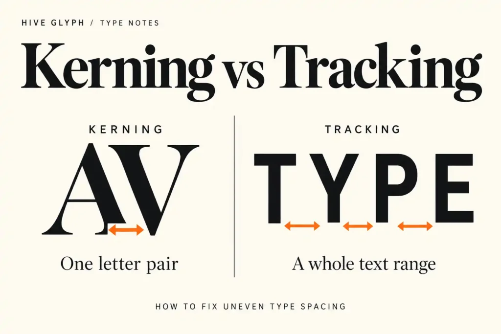
After choosing a glyph, turn off any distracting guides and inspect the word as a whole. Look at the negative spaces between forms, not only the outlines. If one pair feels tight and the next feels loose, correct the local relationship before changing tracking across the entire word. The difference between pair-specific kerning and overall tracking is covered in our guide to kerning versus tracking.
Then test the opposite color condition. White type on a dark background often feels slightly heavier, and thin gaps can appear tighter. A flourish that clears its neighbor in black-on-white artwork may merge visually when reversed or printed with ink spread.
Use alternates differently for logos, headlines, and body text
The right level of expression depends on how often the text changes and how quickly it must be read.
| Use case | What alternates can do well | Main risk |
|---|---|---|
| Logo or wordmark | Create one memorable letter relationship in fixed text | Over-customizing the spelling until recognition slows |
| Packaging headline | Support tone and fill a deliberate area in the layout | Details disappearing at actual print size or across a fold |
| Editorial headline | Add contrast to a short, prominent phrase | A full stylistic set changing too many letterforms at once |
| Body copy | Occasionally solve a repeated-letter or contextual issue | Inconsistent texture across paragraphs |
| Interface label | Rarely needed beyond a controlled brand moment | Reducing clarity in navigation or frequently scanned text |
For a logo, the text is fixed and can be refined letter by letter. For a headline system, the wording changes, so the choice must survive combinations you have not yet seen. Test the full alphabet, numerals, punctuation, and accented characters that the project may require. A stylistic set that looks excellent in one English title may be incomplete for another language or weight.
Body text usually benefits from quieter defaults. An alternate can work when it improves a real collision or provides a consistent text convention, but decorative variation repeated across every line quickly becomes texture. If the reader starts noticing individual letters during a paragraph, the feature is competing with the content.
Test the design at the size people will encounter it
Zoom is generous. It reveals craft, but it also makes delicate gaps and thin details seem more durable than they are.
For packaging, print the panel at 100 percent and view it from a realistic distance. Fold or wrap a rough mockup if the word approaches an edge. Our article on testing packaging typography at actual size explains why a flat, enlarged screen view cannot reveal every problem created by scale, folds, and surrounding information.
For a logo, reduce the artwork to the smallest expected use. Check a single-color version, a reversed version, and a low-resolution preview. You are not trying to prove that the alternate survives every imaginable condition. You are finding the point where its distinctive detail stops contributing and starts interfering.
Also show the word without the surrounding mockup. Lighting, texture, flowers, foil, and photography can make a typographic treatment feel convincing before the letterforms have been evaluated. A plain comparison between default and alternate versions exposes the decision more clearly.
A restrained product example
The Wano Quin serif family is a useful candidate for this exercise because its current product description explicitly includes alternates and ornaments. Its display style invites expressive combinations, particularly for fashion, beauty, and editorial work.
That does not mean every alternate belongs in one word. Set the name in its default forms first. Try one alternate at the beginning or end, then compare it with a version that uses an alternate inside the word. Check whether the flourish creates a clear focal point or merely adds another direction for the eye to follow. Treat the product specimens as possibilities to evaluate, not proof that one combination will suit every project.
Keep the feature reproducible in the handoff
Do not outline the only editable copy as soon as an alternate looks right. Keep a live-text version with the font name, weight, and feature choice recorded. If you used a stylistic set, note the set number. If you selected a single glyph manually, keep a PDF or image reference beside the source file so another designer can confirm the intended form.
For web use, the CSS Fonts specification provides font-variant-alternates and font-specific values for alternates and stylistic sets. It also makes clear that availability and meaning depend on the font. The relevant definitions are in the CSS Fonts Module section on alternates and swashes. Apply the feature to the smallest useful selector, such as a wordmark or display heading, rather than enabling it across the whole site. Test the loaded webfont rather than assuming a desktop file and webfont contain identical features.
Finally, export a proof and reopen it. The goal is not only to preserve the appearance on your own machine. The next designer, printer, or developer should be able to understand which form was intentional and reproduce it without guessing.
A final selection check
- Set the real word in the default glyphs before browsing alternates.
- Name the problem the alternate is meant to solve.
- Change one form at a time and compare it with the default.
- Recheck kerning, counters, and nearby flourishes after substitution.
- Test the smallest size, reversed color, and actual output context.
- Confirm the feature across required weights, languages, and file formats.
- Keep live text and document the selected glyph or OpenType feature.
Stylistic alternates work best when they create a precise difference. One considered substitution can give a word its own voice. A pile of substitutions often hides the word beneath the typeface’s possibilities. Let the default forms carry recognition, then ask the alternate to earn its place.