
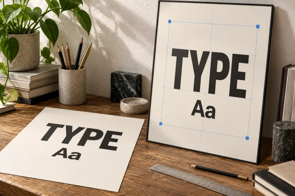
How to Build a Typography Mockup Without Distorting the Typeface
A polished mockup can still misrepresent a typeface when perspective, texture, or scaling changes the letterforms. Use this workflow to keep the presentation realistic and honest.
A polished mockup can still misrepresent a typeface when perspective, texture, or scaling changes the letterforms. Use this workflow to keep the presentation realistic and honest.
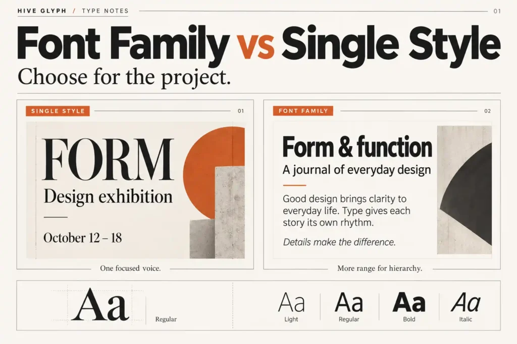
A single font style can be enough for a fixed display role, while a family becomes valuable when hierarchy, revisions, and repeated content must stay consistent. Use this practical test before choosing.
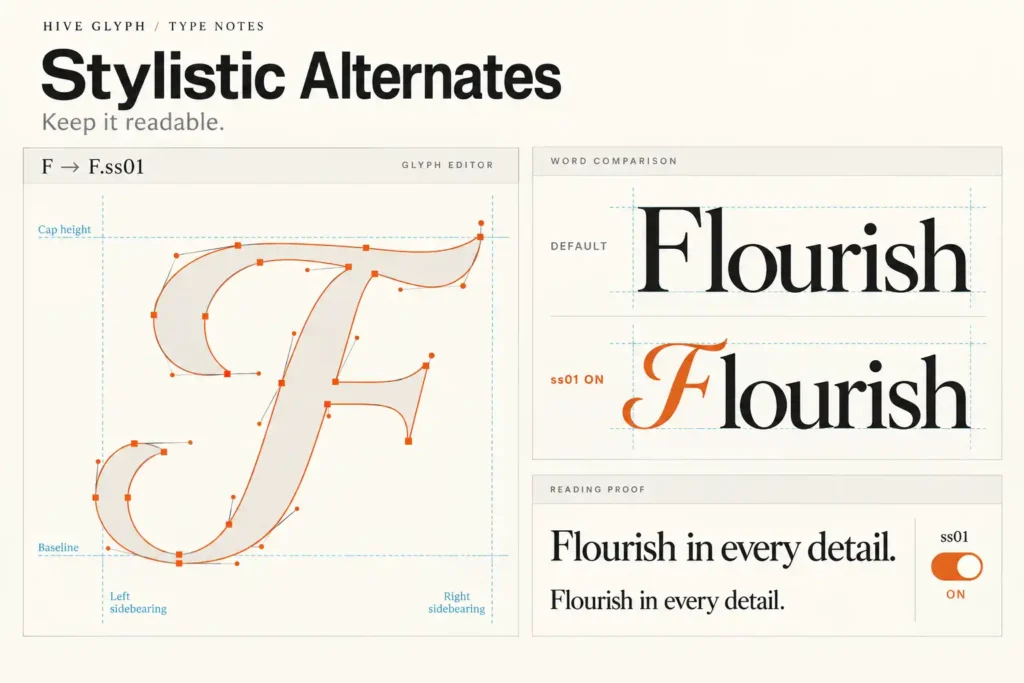
Stylistic alternates can give a familiar word a distinctive voice, but too many substitutions can slow recognition. Learn how to choose and test alternates with restraint.
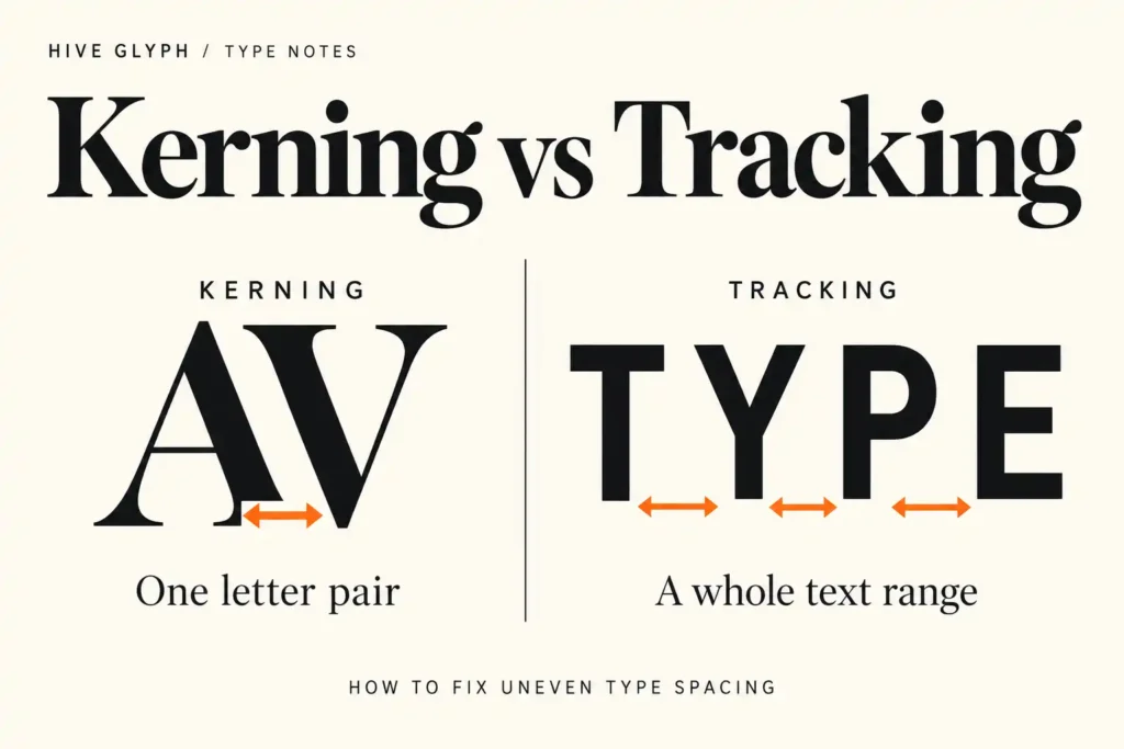
Kerning fixes a specific letter pair, while tracking changes the rhythm of a larger text range. Learn how to diagnose spacing problems before adjusting either one.
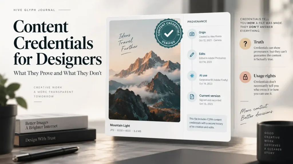
Content Credentials can document an asset’s origin, edits, and AI involvement, but they do not prove truth or usage rights. Learn how to use them in a practical client workflow.
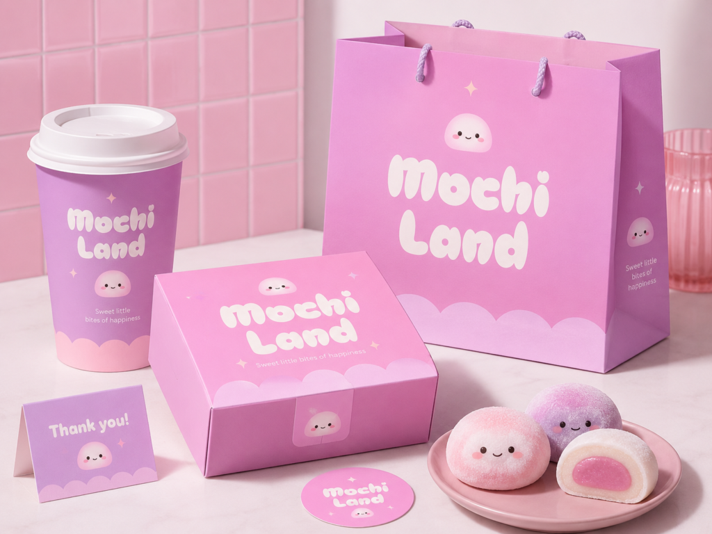
A polished mockup can hide weak hierarchy and unreadable small text. Learn how to test packaging typography at real size before the artwork goes to print.
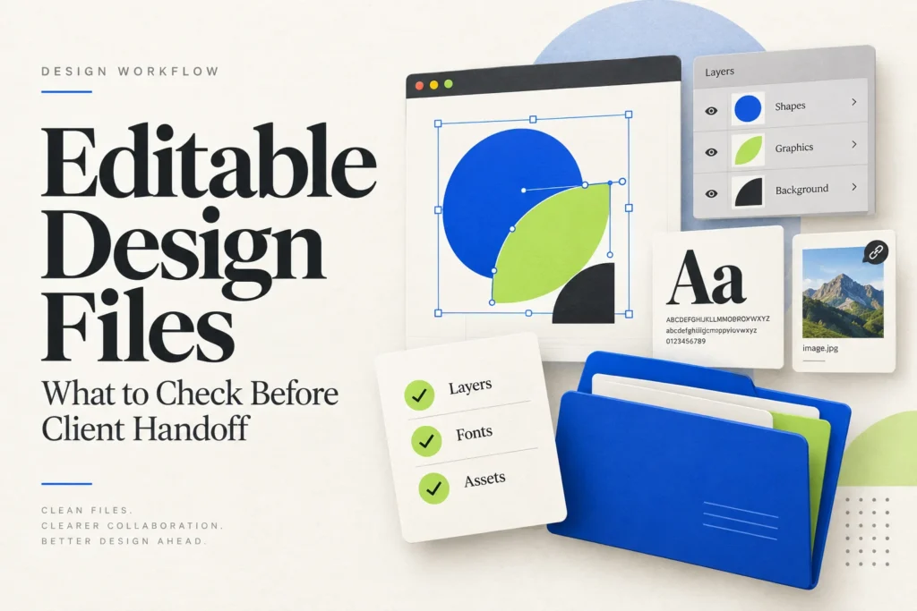
A polished preview is not proof of an editable file. Check text, shapes, image replacement, and export compatibility before handing an AI-assisted design to a client.
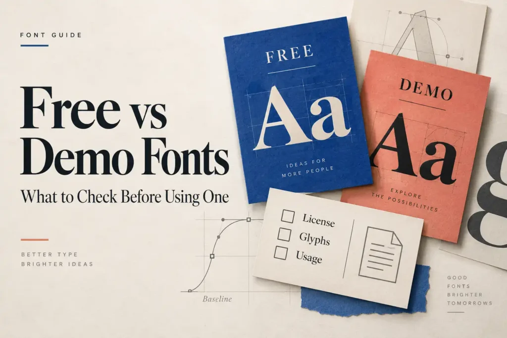
A font can include every style you need and still exclude client work. Learn how to check free and demo downloads, their contents, and the license before delivery.
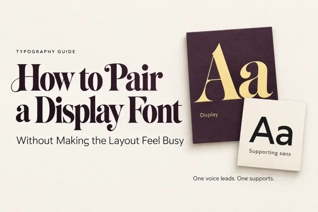
Two attractive fonts can still compete on the page. Learn how to give a display heading and supporting text distinct roles through a fictional exhibition brief.
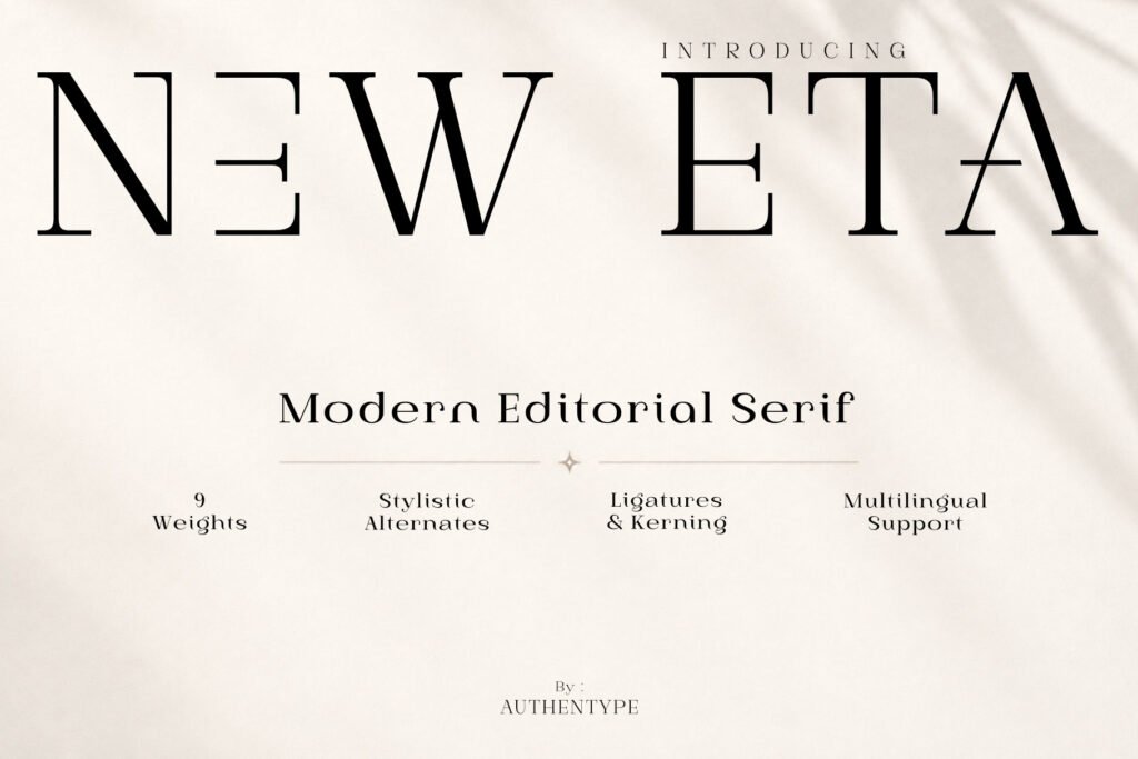
A font that looks right on a bottle may struggle with the campaign headline. Follow a fictional skincare brief to see what to check before committing to a display font.