Font Family vs Single Style — How to Choose for a Real Project
A single font style can be enough for a fixed display role, while a family becomes valuable when hierarchy, revisions, and repeated content must stay consistent. Use this practical test before choosing.
 Written by HiveGlyph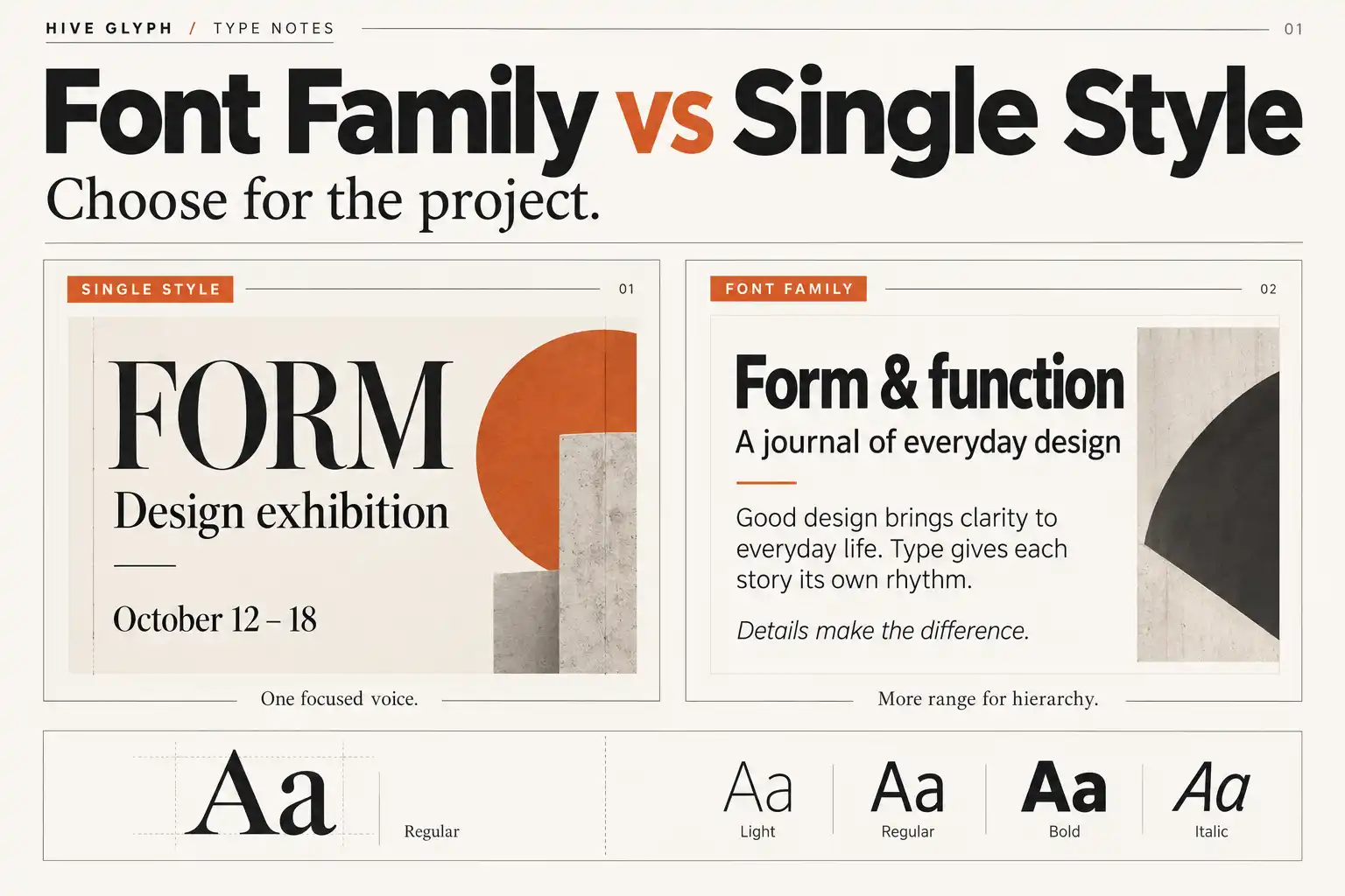
A font family can look like the safer purchase. More weights suggest more freedom, fewer compromises, and a design system that is ready for anything. Yet many projects use one style well and leave the rest untouched. The opposite mistake is just as common. A designer buys Regular for a small job, then has to invent hierarchy with size, color, outlines, and artificial bolding when the project expands.
The choice between a font family and a single style should not begin with the number of files in the package. It should begin with the number of typographic jobs the design must perform. A poster title has different demands from a brand system, even if both use only a few words on the first artboard.
This guide helps you decide which option supports the work you actually have, where a single style is sufficient, and when a broader family prevents avoidable redesign later.
First, separate the family from the style
A family is the shared design system. A style is one member of that system, such as Regular, Medium, Bold, or Italic. The relationship is not just a store label. OpenType fonts contain naming records for family and subfamily information so software can group related faces and distinguish their styles. The OpenType naming specification documents both basic family and subfamily names and the extended typographic family fields used for larger groups.
Weight names also represent an ordered scale rather than decorative marketing terms. The OpenType weight-class specification maps commonly used values from Thin through Black. That does not mean every 700-weight font will look equally bold. Stroke contrast, counters, proportions, and the overall drawing still affect the result. The scale tells applications how the styles relate, while the design determines how each one feels.
This is why choosing a family is not simply buying “more font.” You are choosing a set of related tools that can divide emphasis without changing the underlying voice.
Count roles before counting pages
A one-page design may need several roles. A twenty-page lookbook may need only two. List the text functions before deciding what to buy or install.
- Primary display title
- Secondary heading
- Introductory paragraph or deck
- Body copy
- Caption, price, credit, or technical note
- Button, label, or navigation text
- Emphasis inside running text
Now mark which roles must use the typeface under consideration. If it is responsible only for the primary title, a single style may be completely adequate. The body and small information can belong to a quieter companion family. Our guide to pairing a display font without making the layout busy explains how to divide those responsibilities without creating visual competition.
If the same typeface must handle title, subheading, body, and captions, one style has to create every distinction through size and spacing. That can work in a disciplined editorial system, but it gives the designer fewer controls when the content changes. A family offers weight or slope as additional signals, which can make the hierarchy easier to maintain across formats.
When one style is the better decision
A single style is not an incomplete solution. It is often the cleaner one when the role is narrow and stable.
The text is fixed
A logo, campaign line, book title, or event name may be refined as a specific composition. You can adjust size, spacing, and line breaks for that known text. The design does not need to survive hundreds of future headings, so additional weights may add little practical value.
The typeface has one clear display job
A distinctive serif or experimental display face may be strongest when it appears only in large titles. Asking the same design to handle ingredients, interface labels, or long reading text can weaken both clarity and character. One well-chosen display style plus a capable text family is often more useful than forcing a single family into every role.
The project has a short life
A poster, launch graphic, or limited campaign can be tightly art-directed. If there is no continuing content system and no handoff to a larger team, the flexibility of a full family may not be necessary.
The contrast comes from another family
Hierarchy does not have to come from weight alone. A display serif can work with a neutral sans, or a bold geometric title can sit above a restrained text face. In that arrangement, buying several display weights may duplicate a function already handled by the pairing.
The important condition is that the single style remains intentional. If the layout keeps asking for “slightly stronger,” “less loud,” or “more readable at small size,” the project is already revealing a need that one style cannot comfortably meet.
When the family earns its place
A family becomes valuable when the design must remain coherent while the content and format keep changing.
The project needs hierarchy without changing personality
Regular and Semibold can separate body text from subheadings while keeping letter construction, proportions, and spacing behavior related. A stronger weight can create emphasis without introducing a second visual language. This is especially useful in magazines, brand guidelines, websites, packaging ranges, and presentation systems where many people will produce new layouts.
The content will grow
The first deliverable may contain only a homepage and one product page. Later, the system may need comparison tables, promotional banners, documentation, email graphics, and small labels. A family gives later designers more room to solve new hierarchy problems without replacing the original type choice.
Several output sizes must feel related
A light display weight can look refined in a large headline but become fragile in a small caption. A medium or semibold weight may hold up better at reduced sizes. This does not guarantee that every family member is suitable for body text, but it gives you real drawn alternatives rather than relying on software to make a face heavier.
The project needs true italic or oblique styles
If italics carry emphasis, titles, quotations, or another repeated function, check that the family includes an actual sloped style. On the web, browsers can synthesize bold or oblique forms when the requested face is missing unless synthesis is controlled. The CSS Fonts specification on font synthesis describes this behavior. A simulated result is not a substitute for reviewing a style drawn by the type designer.
Other people will use the system
A family reduces improvisation during handoff. Instead of asking every designer to invent a treatment for medium emphasis, the guide can specify a style, size, and spacing combination. The advantage is not variety for its own sake. It is repeatability.
Use a minimum viable family test
You rarely need every possible weight to build a useful system. Start with the roles and find the smallest set that creates clear differences.
| Project need | Likely starting set | What to verify |
|---|---|---|
| Fixed display composition | One style | Final wording, size, spacing, and output method |
| Simple identity with supporting text family | One or two display styles | Logo use, campaign headings, and contrast with the companion font |
| Small editorial system | Regular, Medium or Semibold, Bold | Body texture, heading contrast, captions, and long-form rhythm |
| Content-rich brand system | Several weights plus needed italics | Templates, digital states, print sizes, and team handoff |
| Interface or responsive website | Styles mapped to text tokens | Loaded files, synthetic styles, performance, and fallback behavior |
These are starting points, not universal packages. A high-contrast editorial serif might use Medium for body copy, while another family is designed around Regular. Two adjacent weights may look almost identical at headline size but clearly different in paragraphs. Test the actual font with the actual text instead of choosing only from weight names.
Run a content test before committing
Build one page that contains the hardest combination the project is likely to encounter. Include a long title, a short title, mixed case, numbers, punctuation, a two-line paragraph, and the smallest required information. If the project uses product names or multiple languages, include realistic examples rather than a pangram alone.
Set the page first with the single style. Use size, space, alignment, and color to create hierarchy. If the distinctions remain clear and the layout still feels composed, you may not need more.
Then introduce one additional weight. Ask what it fixes. Does it make a subheading easier to scan? Does it prevent a small label from becoming too delicate? Does it create a better transition between the display title and body copy? If the new weight has no specific job, it is not yet adding value.
Continue only until every recurring role has a dependable treatment. This avoids two common problems. The first is buying a large family and using arbitrary weights because they are available. The second is limiting the system so tightly that designers compensate with effects, outlines, extreme tracking, or unrelated typefaces.
New Eta as a family-scale example
The New Eta Editorial Serif page currently lists nine weights from Thin through Black. That range makes it a useful candidate when a project needs an expressive editorial voice across more than one level of emphasis.
For a fashion poster with one large title, a single suitable weight may do the job. For a magazine identity, the decision changes. Covers, section openers, pull quotes, contents pages, captions, and campaign graphics may need different degrees of presence while still looking related. In that case, the value of the family comes from assigning roles to a small, tested subset of its weights.
Do not assume that all nine should appear in one layout. Begin with three contrasting points, such as a light display weight, a middle weight, and a strong weight. Test them in the intended sizes. Add another only when it solves a gap you can name.
Make the purchase follow the system
Before choosing between a font family and a single style, answer four questions.
- How many recurring text roles must this typeface handle?
- Will the wording, format, or production team change after launch?
- Can a companion typeface handle the secondary roles more effectively?
- Which additional style solves a visible problem in the test layout?
Also review the applicable license for the intended use. The number of styles and the permission to use them are separate questions. A large package does not automatically cover every channel, and a single style may still require the correct desktop, webfont, app, or other license for the project.
Choose one style when the typographic role is focused, fixed, and supported by the rest of the system. Choose a family when the same voice must stretch across hierarchy, formats, and future content. The best option is not the package with the most files. It is the smallest coherent set that keeps the design working after the first polished mockup.