
How to Pair a Display Font Without Making the Layout Feel Busy
Two attractive fonts can still compete on the page. Learn how to give a display heading and supporting text distinct roles through a fictional exhibition brief.
 Written by HiveGlyph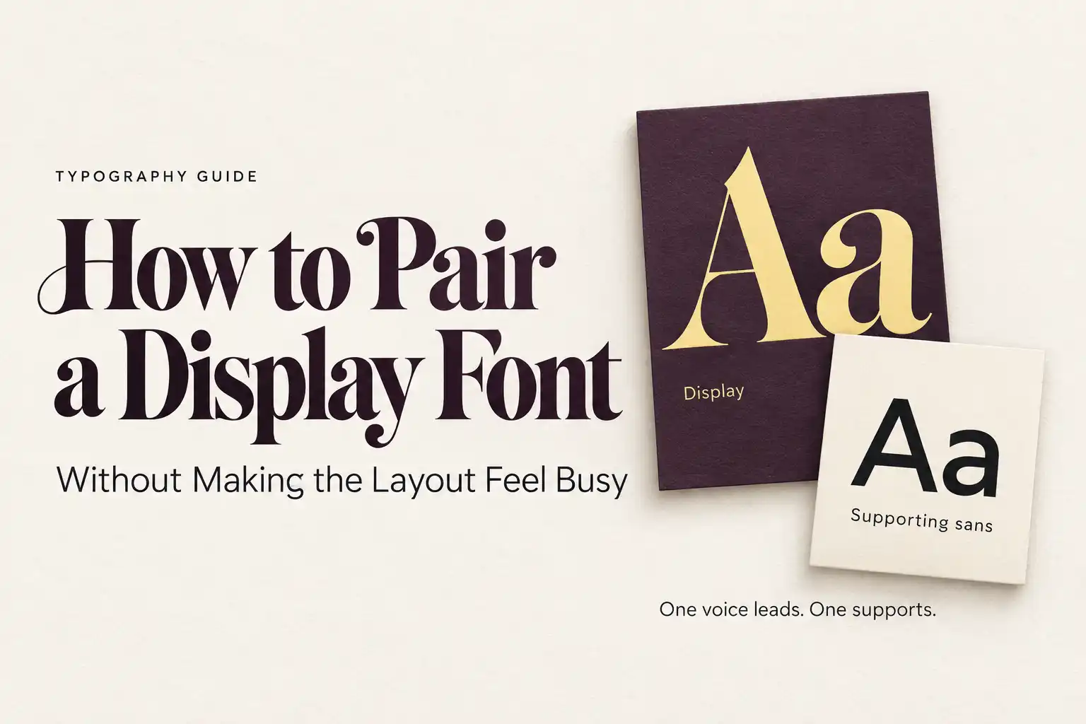
The title is expressive. The subtitle is expressive. Even the date has a little flourish. Each choice looked good when it was on its own; together, they make a simple announcement strangely difficult to read.
It is easy to blame the font combination. Sometimes the problem is more ordinary: nobody has decided which line should lead. Adding a quieter font might help, but it will not automatically fix a subtitle that is almost as large as the title or a date pressed too close to the description.
To pair a display font without making the layout feel busy, give it a defined job and build the surrounding text around that job. The useful comparison is between complete layouts, not two alphabet samples.
Let’s work through a fictional ceramics exhibition called “Made by Hand.” This is a design exercise, not a client case study or a tested recommendation for a particular font pair. The poster needs a title, a short description, an opening date, a venue, and a booking address. That gives us enough different kinds of information to see where a pairing earns its place.
Decide what the reader should notice first
For this exhibition, the title should introduce the character of the event. The next line explains what it is: “An exhibition of contemporary ceramics.” Beneath that come “Opening Saturday, 24 October” and the venue details. These lines matter, but they do not all need the same treatment.
Write those roles down before opening another font menu. The display face belongs to the title. A supporting face must make the explanation and practical information easy to follow. At this stage, there is no reason to assign a third family to the date.
Jake Giltsoff’s font-pairing framework for Adobe Design starts with one chosen typeface and considers the relationship built around it. That is a useful way to limit the search: keep one decision stable while you evaluate the other.
If you have not chosen the headline face yet, our guide to choosing a display font for headlines and branding covers that earlier step. Here, assume the title already has a direction you want to keep.
A companion should solve a specific problem
Say the title uses a distinctive serif with strong stroke contrast. You like its presence at poster size, but the same treatment makes the exhibition description look fussy. Your search is now more precise: find a face that makes that sentence comfortable to read without making the poster feel like two unrelated designs.
Try a restrained sans serif first if you need a clear departure from the title. That is a starting point, not a rule that every serif needs a sans. A text serif could also work if the hierarchy is clear and the overall character suits the event.
Set the actual description in each candidate. Add the date and venue beneath it. A companion that looks attractive in three large words may behave quite differently in a sentence with punctuation and several short words. Include the information it will have to carry.
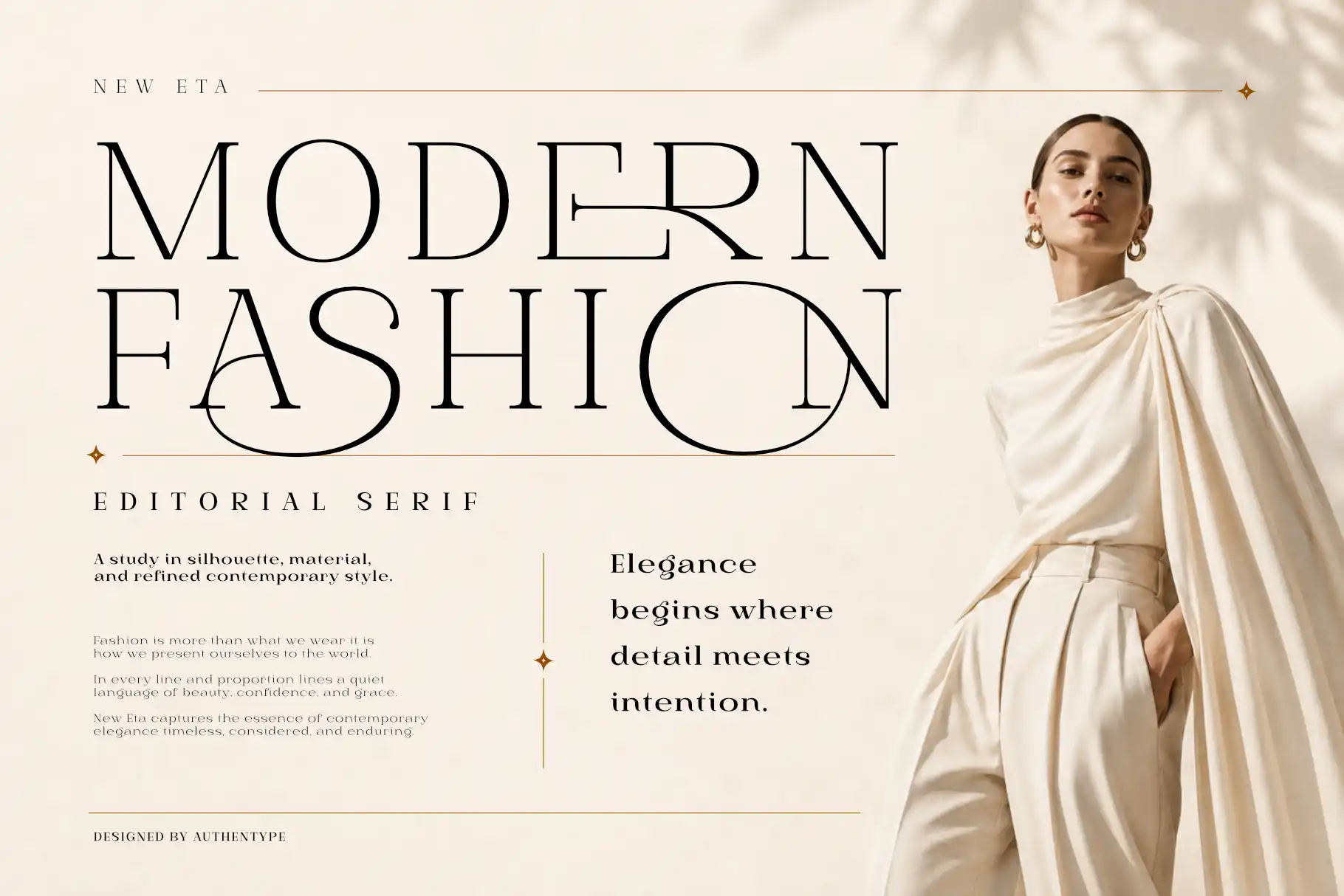
For a possible editorial heading direction, New Eta is a high-contrast serif family worth exploring. Its presence could suit the exhibition title, while the supporting face takes responsibility for the longer explanation. This is a candidate direction; a specific combination still needs to be evaluated in the finished layout.
Avoid choosing the body face because it reproduces every interesting detail of the heading. If both are full of gestures, the supposedly supporting line may keep pulling attention away from the title.
Compare the apparent size, not just the number
Two body fonts set at the same point size can occupy the page very differently. Look at the lowercase letters, how dense a line appears, and how much space the sentence needs. The size field is a setting, not a guarantee that two faces will look equally large.
On the ceramics poster, keep the title fixed and switch only the supporting font. If one option suddenly makes the description look like a second headline, reduce its size slightly and compare again. If another feels fragile, try an appropriate heavier style before rejecting the whole family.
Make these changes at the intended viewing scale. Enlarging a small screenshot until every letter looks generous tells you little about how the practical information will read on an actual phone or printed flyer.
There is no universal headline-to-body ratio that will settle this for you. A short exhibition title can have room for a large size difference. A dense programme page may need a more restrained hierarchy. Keep the reading order clear rather than forcing both into one numerical recipe.
Separate a font problem from a layout problem
Suppose the title and description still compete after you have chosen a quieter companion. Before replacing it, duplicate the layout and change only the space between those two lines.
If that adjustment makes the title easier to read as a distinct unit, the pairing may not have been the main problem. The information was grouped too tightly. If the description still dominates, compare its weight and size. Figma’s typography guide discusses hierarchy through several interacting choices, including size, spacing, alignment, and typeface. It helps to examine those choices separately.
For “Made by Hand,” build three versions using exactly the same words and fonts:
- A baseline: the current title, description, and details, with no new adjustments.
- A spacing revision: change the gaps between information groups while keeping the type sizes and weights.
- A hierarchy revision: use the improved grouping, then adjust the supporting text’s size or weight.
Compare the versions at the same scale. You are asking which change helped, not which thumbnail happens to look more dramatic. Keep the earlier versions so you can undo a direction that only seemed better because it was new.
The date does not need another personality
Small information is often where an otherwise coherent pairing becomes complicated. A date gets an outlined style, the venue gets an italic, and the booking address receives wide letterspacing. Suddenly there are several visual voices, even if the layout technically uses only two families.
Try the date and venue in the supporting face first. Give the date a little more emphasis if it matters to the announcement, but do not make every line equally insistent. A change of weight may be sufficient. Alignment and space can distinguish the venue from the booking address without introducing another typeface.
This also gives you a practical check on the companion. Look at its numerals, the punctuation in the address, and any accented place names the real project needs. “It works well with the heading” is not enough if essential information becomes awkward in the same design.
Keep the required characters in the comparison sheet. It is easier to spot a missing or unsuitable detail there than after you have exported a batch of event graphics.
Move the pairing into a less generous format
The poster is only one application. Put its title and explanation into a square announcement and a narrow event card. These adaptations reveal whether you have a reusable relationship or one carefully balanced arrangement.
Do not preserve the poster’s relative sizes at any cost. The event card may need the title to be smaller and the details comparatively larger. What should remain recognisable is the division of roles: expressive title, clear explanation, accessible practical information.
If the small version feels crowded, remove optional styling before removing useful content. Return the date to its normal treatment. Reduce unnecessary capitals. Give the description a sensible line break. Then ask whether the supporting font’s width is creating a problem that another candidate could handle better.
For a website, the pair also needs to function once fonts load and text reflows. That is a separate production check from whether the combination looks good in the design file. Our guide to website fonts and loading performance covers that side of the decision.
Know when a second family is unnecessary
After simplifying the announcement, you may find that one suitable family handles everything you need. Keep that version in the comparison. A two-font solution does not deserve to win simply because the project began as a pairing exercise.
A companion is valuable when it performs a role the first family cannot comfortably fill, or introduces a contrast that serves the brief. If it adds maintenance without improving the result, there is no need to keep it.
When you do settle on a pair, record more than the names. Save the styles used for the title, description, and details, along with a poster and a small-format example. Note which adjustments belong to a one-off composition and which should carry into future announcements.
For our fictional exhibition, the pairing is doing its job when the title invites attention, the description explains the event, and the date can be found without hunting. Open the small event card one last time. If the decorative details are the first thing you notice and the opening date is the last, there is still something to simplify.
[…] package or whether a restrained pairing will improve the information structure. Our guide to pairing a display font without making the layout busy covers that decision in more […]
[…] accompany the display word, solve the hierarchy before polishing individual pairs. Our guide to pairing display fonts without making a layout busy explains how to separate roles between expressive and supporting […]