Kerning vs Tracking: How to Fix Uneven Type Spacing
Kerning fixes a specific letter pair, while tracking changes the rhythm of a larger text range. Learn how to diagnose spacing problems before adjusting either one.
 Written by HiveGlyph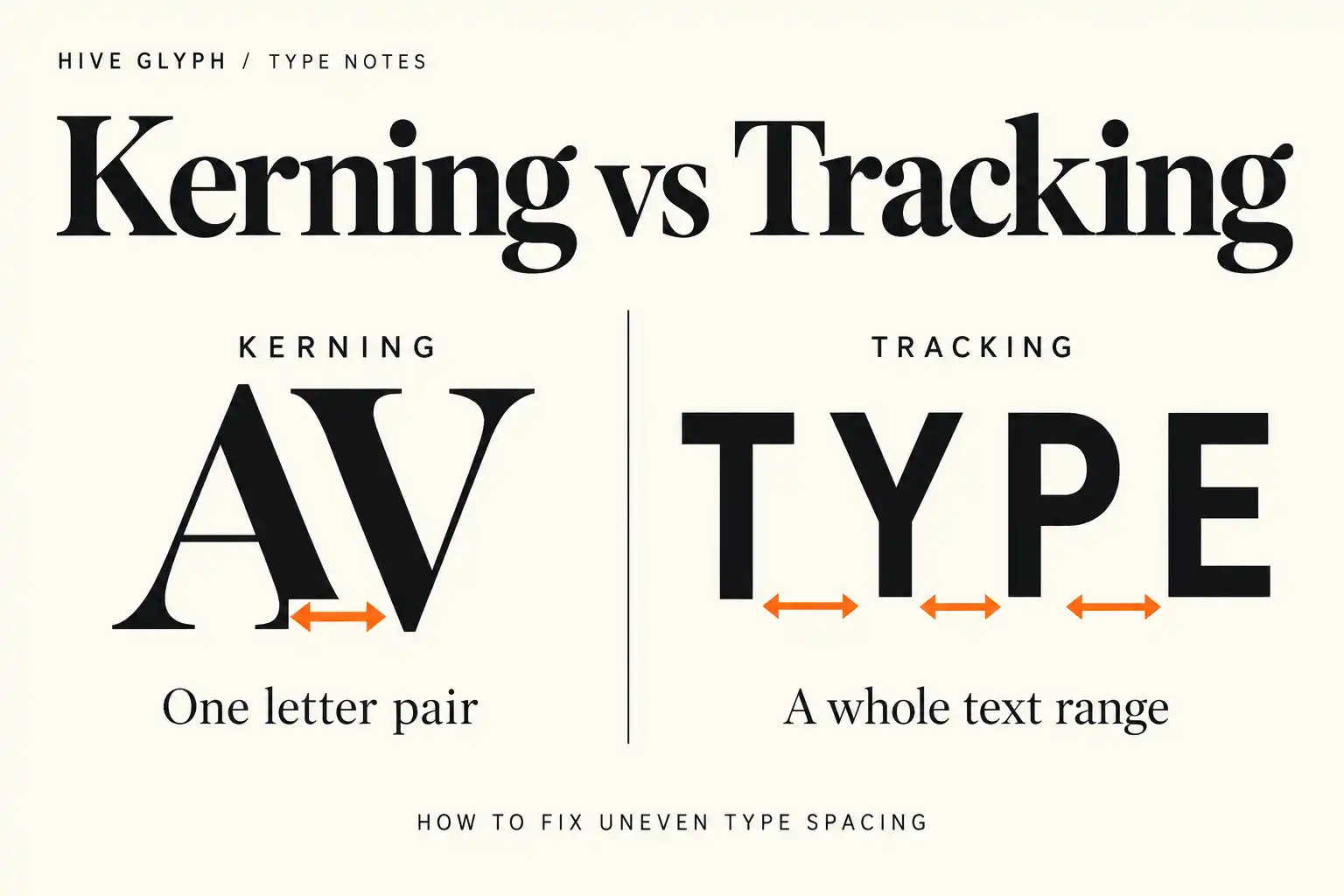
A headline feels wrong, so the tracking is reduced. The word becomes tighter, but the original problem remains. One gap still looks open while several other pairs now feel crowded.
This is a common spacing mistake. Kerning and tracking both change the space around letters, yet they solve different problems. Kerning corrects the relationship between a specific pair. Tracking changes the overall spacing across a selected range of text. Using one as a substitute for the other can flatten the rhythm that the type designer built into the font.
The practical goal is not to make every gap mathematically equal. It is to make the sequence of shapes feel visually balanced at the size, weight, and setting in which the text will be read.
Start by identifying the scale of the problem
Before touching a spacing control, look at how widely the problem spreads.
If one pair looks awkward while the rest of the word feels even, inspect the kerning. Typical problem shapes include a diagonal next to a vertical, a round letter beside a flat edge, or punctuation following an overhanging form. The exact result depends on the typeface, so familiar examples such as AV, To, WA, and Ty are only starting points.
If the complete word, line, or block feels too airy or too dense, tracking is the more relevant control. It changes the spacing across the selected characters rather than targeting one relationship.
Sometimes neither control is the real answer. A headline may feel packed because the chosen weight is too heavy for the available width. Body copy may look loose because the text is too small or the line is too long. A narrow panel may need a more compact style rather than increasingly negative tracking.
| What you see | Check first | Likely action |
|---|---|---|
| One obvious gap inside an otherwise balanced word | The two adjacent letter shapes | Adjust kerning for that pair |
| The whole headline feels loose or crowded | Size, weight, width, and overall rhythm | Adjust tracking modestly or change the type choice |
| Many unrelated pairs look uneven | Built-in kerning and application settings | Restore metrics kerning and test the font before manual repair |
| Body text looks tiring across several lines | Measure, size, leading, and rendering | Fix the text setting rather than hand-kern individual words |
Kerning is a pair-level correction
In an OpenType font, kerning is usually stored as positioning data. The current OpenType specification for the GPOS table describes pair adjustment positioning as a way to change the placement or advance of two glyphs in relation to one another. Pair data may address individual glyph pairs or groups of similar glyphs through classes.
That detail explains why good font kerning is broader than a list of famous combinations. A type designer can group related left and right shapes so that one adjustment supports many useful pairs. Exceptions can then handle the relationships that do not fit the group.
For the graphic designer, the first sensible step is to respect that built-in work. In a layout application, begin with Metrics or Auto kerning. Adobe explains that metrics kerning uses the pairs included in the font, while optical kerning calculates spacing from adjacent shapes. Manual kerning remains available for a specific pair.
Do not begin by placing the cursor between every letter. First set the final word, weight, size, and capitalization. Read the whole word as a shape. Then isolate the pair that interrupts the rhythm.
Tracking changes the atmosphere of the setting
Tracking operates across selected text. In Adobe’s Illustrator spacing documentation, tracking is defined as loosening or tightening the spacing across characters in selected text or an entire text block. Kerning and tracking are cumulative, which means a tracking change does not erase the logic of individual kern pairs. It shifts the overall setting around them.
This makes tracking useful for controlled changes in tone. A short uppercase label may benefit from more air. A very large display word may need slightly tighter spacing because the gaps become more visible at scale. Those are visual decisions, not fixed recipes.
Tracking becomes destructive when it is used to force copy into a box. Heavy negative values can cause rounds, diagonals, and punctuation to collide unevenly. Large positive values can fragment lowercase words and weaken the shapes that help readers recognize them. If the change has to be extreme, reconsider the font width, point size, line break, or copy length.
Use metrics, optical, and manual kerning in that order
Metrics kerning is normally the safest starting point because it uses the spacing decisions stored in the typeface. It also preserves consistency when the same font appears across many layouts.
Optical kerning can be useful when a font has sparse pair data, when two different typefaces meet in one line, or when a large custom headline exposes an unusual relationship. Adobe notes that optical kerning evaluates the shapes of adjacent characters rather than relying only on stored pairs. That can rescue a difficult combination, but it is still an application-generated interpretation. Compare it with the font’s metrics rather than assuming optical is automatically better.
Manual kerning belongs at the end of the process. Use it when one visible pair still breaks the rhythm in a stable piece of display text. It is less suitable for live body copy, translated text, responsive headlines, or templates where the words will change.
A useful rule is simple. If the content changes frequently, prefer repeatable font and layout settings. If the content is fixed and prominent, a small manual correction may be justified.
Judge space by area, not by distance
The closest points between two letters do not tell the whole story. A diagonal creates open space beneath its stroke. A round character moves away from its neighbor near the top and bottom. A flat-sided pair may need more measured distance than a diagonal pair while still appearing tighter.
That is why equal numerical gaps often look unequal. Instead of measuring the narrowest point, compare the overall areas of white space. Squint slightly or step back from the screen. The letters should remain identifiable, but the distracting details become quieter and the spacing rhythm becomes easier to see.
It also helps to cover part of the word and compare three-letter groups. In a hypothetical word such as RAVEN, inspect RAV, AVE, and VEN rather than adjusting AV in isolation. A change that repairs one pair may make the transition on either side feel abrupt.
Set the real text before making corrections
Kerning a placeholder word proves very little about the final layout. Use the actual product name, punctuation, numerals, and capitalization. Test the longest likely variation if the design belongs to a family of packages or campaign templates.
Weight matters too. A pair that feels comfortable in Regular may close dramatically in Black because the strokes occupy more of the available space. Do not copy one manual value across every weight without looking. The same warning applies when changing from lowercase to capitals or enabling stylistic alternates.
For example, Kinetix Luxe contains nine weights from Thin to Black. Its angular display structure makes it a useful candidate for technology, automotive, or industrial headlines, but the actual product name still needs testing in the chosen weight and size. A value that suits a light, widely set line should not be assumed to work in a dense black headline.
If another face will accompany the display word, solve the hierarchy before polishing individual pairs. Our guide to pairing display fonts without making a layout busy explains how to separate roles between expressive and supporting type.
Check the result at delivery size
Spacing changes with context. A pair that looks open at 300 percent zoom may read naturally on a printed label. A manually tightened logo may become muddy when reduced for a social avatar. Always evaluate the type at its actual delivery size and from a realistic viewing distance.
For packaging, print the design at 100 percent and place it on the physical form. The workflow in our actual-size packaging typography guide helps expose spacing that fails after a word wraps around a curve or moves near a fold.
For web typography, remember that kerning and letter spacing remain separate operations. The CSS Fonts specification defines font-kerning as the control for metric kerning. It also states that letter spacing is applied after kerning. If precise kerning matters for a headline, font-kerning: normal explicitly enables the font’s kerning data, while letter-spacing controls the broader spacing decision.
Test the live page rather than relying on a design-app screenshot. The browser, font file, CSS, screen density, and responsive line break all take part in the final result.
A reliable spacing pass
- Set the final wording, size, weight, case, and line break.
- Restore Metrics or Auto kerning and return tracking to a neutral starting point.
- Read the word at actual size before zooming in.
- Decide whether the problem affects one pair or the whole setting.
- Adjust tracking only when the overall rhythm needs to change.
- Compare Metrics and Optical kerning if the built-in result remains weak.
- Apply manual kerning only to the specific pair that still distracts.
- Check neighboring pairs after every manual correction.
- Repeat the test in the final medium, including print or the live browser.
The order matters. Starting with manual kerning can turn a typeface into a chain of local fixes. Starting with the text system keeps the font’s own spacing intact and limits intervention to the places that genuinely need it.
Kerning repairs a relationship. Tracking changes a texture. Once that distinction is clear, spacing becomes less about nudging letters until they look busy and more about finding the simplest correction that restores an even reading rhythm.