Hive Levitto for Multilingual Typography | Hive Glyph
 Written by HiveGlyph
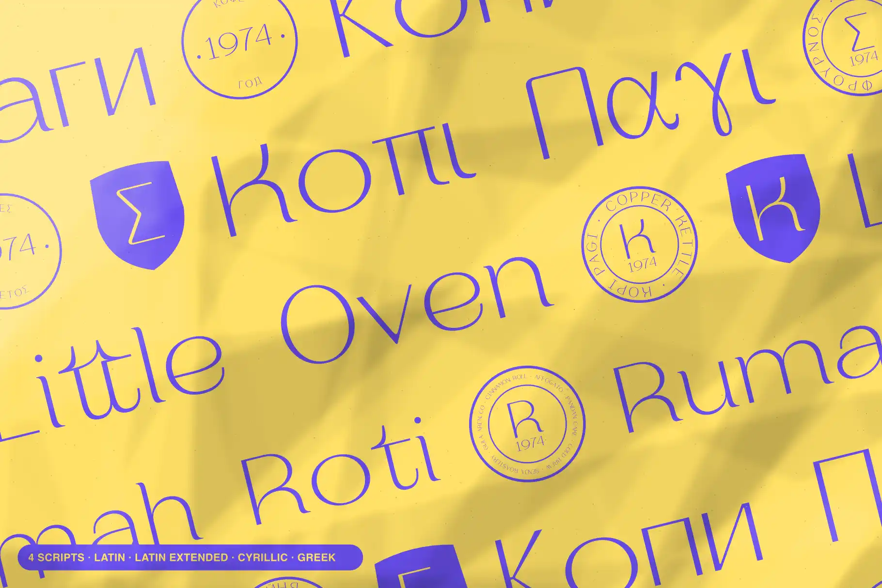
Multilingual Typography with Hive Levitto for Beauty and Editorial Brands
A beauty campaign can begin with a short English headline and quickly grow into something more demanding. A French product name introduces accents. A Polish edition needs a different set of letters. A Greek headline changes the script entirely.
Those details belong to the identity from the beginning. If the typography only feels considered in the first language, the other editions can look like adaptations made after the design was finished.
Hive Levitto offers a starting point for exploring a more consistent multilingual display identity. Presented as an extended light serif, with Light and LightItalic styles, it brings a particular design direction to the conversation: wide proportions, a light presence, and room for expressive headlines.
Its supplied language-detection report lists 108 entries. For designers working across beauty, fashion, and editorial projects, that coverage is worth exploring through the words the brand actually needs.
A multilingual font should preserve the personality of the words
Choosing a typeface for an international brand involves more than finding letters that appear without an error.
A campaign title needs to retain its intended character when the wording changes. A quiet, spacious composition should still feel deliberate in another language. An accented capital should feel integrated with the word around it. A second script deserves the same attention as the first.
For a beauty brand, this could mean keeping a collection name visually related across a product launch, a magazine advertisement, and an invitation. For an editorial team, it could mean using a recognizable headline voice across editions with different languages.
The useful question is specific:
Can this typeface carry our actual names and headlines while keeping the intended tone?
That is a more productive way to evaluate multilingual typography than choosing whichever font advertises the largest language count.
Where Hive Levitto fits
Hive Levitto’s product presentation places it in fashion, beauty, magazines, packaging, and invitations. Its extended light serif direction makes it a candidate for projects where the headline has space to become part of the composition.
Consider a perfume campaign with a short collection name above a bottle photograph. A wide display treatment could establish the pace of the page, while a smaller supporting face handles the fragrance description.
On a fashion feature opener, the same approach could give the title a distinct presence without filling the page with heavy type. An invitation offers another possibility, with the event name carrying the visual identity and the practical information sitting underneath.
These are proposed applications, rather than tested results. The important distinction is the role assigned to the font.
Start by considering Hive Levitto for:
- Collection names and short campaign headlines.
- Magazine covers and feature titles.
- Beauty-brand presentation titles.
- Invitations and selected packaging display text.
Assess small descriptions, instructions, and other dense information separately. A display font does not need to handle every text role to make a strong contribution to a brand.
What “108 detected language entries” tells you
The supplied detection list includes English, Indonesian, French, German, Portuguese, Spanish, Polish, Turkish, Greek, Ukrainian, and many others.
It also includes languages that are less frequently shown in a short marketing specimen, such as Welsh, Maltese, Hawaiian, and Lower Sorbian. That makes the list useful when a project extends beyond a familiar English-language demonstration.
However, a detection result needs a clear interpretation.
The product page explains that its language detection uses the Unicode character mapping present in the selected font style. Microsoft’s OpenType documentation for the character-to-glyph mapping table describes how character codes map to glyphs inside a font. That mapping establishes a technical foundation for displaying text. It does not, by itself, evaluate the quality of a finished headline. Microsoft Learn
The supplied report contains repeated or qualified labels, including Serbian twice and Uzbek alongside Uzbek (Latin). The count should therefore be read as the report’s entries, rather than a claim that 108 distinct languages have each received a complete editorial review.
For a design project, use the list to build a shortlist. Then check the required language, script, style, and exact wording.
Bring the accents into the design early
Accents and other marks should appear in the first serious typography proof.
A specimen containing only an unaccented brand name leaves important questions unanswered. Does an accent have enough room above the capital? Does the word still feel balanced? Does the line sit comfortably under the heading above it?
Create a short reference sheet with the approved product names, campaign titles, and contributor names. Keep their original spelling intact.
For an early character inspection, the following strings offer different details to examine:
| Sample | What to inspect |
|---|---|
| Crème | Placement and visual balance of the grave accent |
| ÉCLAT | Space above an accented capital |
| São | Relationship between the tilde and the lowercase letter |
| Łódź | Treatment of the stroke and accents within one word |
| I İ ı i | Distinction between dotted and dotless forms |
These are inspection strings, not translations of a shared campaign message. They are also not proof that a particular font file has passed a rendering test.
Enter them in the selected style, inspect the result, and then replace them with the actual project copy. The final wording may introduce combinations that a short sample never reveals.
Avoid removing an accent simply because it complicates the composition. Adjust the typography around the approved spelling.
Identify the script as well as the language
A language name alone may leave an important production detail unresolved.
The supplied list includes Serbian in two places and explicitly identifies Uzbek (Latin). Before preparing artwork, establish which written form the project requires. Do not assume that a repeated label proves identical coverage across scripts or styles.
This becomes especially important when the brief expands from Latin-script text into Greek or Cyrillic text.
Start each version with correctly encoded, approved copy. Do not substitute a Latin letter because its silhouette resembles a letter in another script. Keep the text intact and evaluate the actual characters.
Then ask a reader familiar with that language to review the typography in context. Their contribution goes beyond catching spelling mistakes. They can identify an unfamiliar-looking form, an awkward emphasis, or a word break that a designer unfamiliar with the script might overlook.
The goal is to give each version a convincing typographic voice while preserving the language itself.
Use Light and LightItalic with a clear purpose
The product’s style selector lists Light and LightItalic. That offers a focused starting point for establishing contrast within the display typography.
A reasonable direction to explore is Light for the principal title and LightItalic for a short secondary phrase. Keep the hierarchy simple enough that the reader understands why the style changes.
For example, a hypothetical fragrance presentation might use:
- Light for the collection name.
- LightItalic for a short editorial phrase.
- A separate text face for the descriptive paragraph and practical details.
Test both Hive Levitto styles with the required language samples. A successful proof in one style does not establish how the other will handle every combination.
Keep the initial comparison free of decoration. Once the default text works, consider whether an available alternate or flourish improves a particular word. Our guide to using stylistic alternates without hurting legibility provides a method for making those decisions without losing word recognition.
Build a brand specimen around one realistic project
A useful multilingual specimen should make a design decision easier.
Imagine a hypothetical independent beauty label preparing an English, French, and Polish launch. The brand name stays unchanged, while the campaign headline and product description are localized.
Begin with one composition containing the brand name, the approved headline, and a brief description. Give Hive Levitto responsibility for the display text. Keep the descriptive text in a supporting face selected for that role.
Duplicate the composition for each language, preserving the photographs and colors so the typography can be compared clearly.
Review three relationships.
First, look at the headline’s presence. Does one version become much more forceful or fragile than the others? Adjust the composition with the intended hierarchy in mind.
Next, inspect the language-specific characters. Look for unexpected changes in shape, crowded marks, or letters that appear disconnected from their neighbors.
Finally, review the relationship between the headline and the supporting text. The display face should make the identity recognizable while leaving the description comfortable to read.
If translated wording needs a different arrangement, our guide to multilingual campaign layouts covers how to adapt the composition. Here, the decision is whether Hive Levitto gives the required words a convincing shared character.
Give the first preview meaningful copy
The most useful first interaction with Hive Levitto is to replace the demonstration sentence with your own text.
Use the collection name you expect to print. Add the accented surname that will appear on the cover. Include the Greek or Cyrillic headline if that is part of the brief. Compare Light and LightItalic using those same words.
Save the strongest candidate as a plain typography proof before adding elaborate imagery or materials. That makes the letterforms easier to judge and gives language reviewers something clear to assess.
Explore Hive Levitto and preview the available styles. Begin with one headline from your next beauty, fashion, or editorial project, then bring its other language versions into the same proof. The result will tell you far more about its place in the identity than a language count alone.