
How to Choose a Display Font for Headlines and Branding
A font that looks right on a bottle may struggle with the campaign headline. Follow a fictional skincare brief to see what to check before committing to a display font.
 Written by HiveGlyph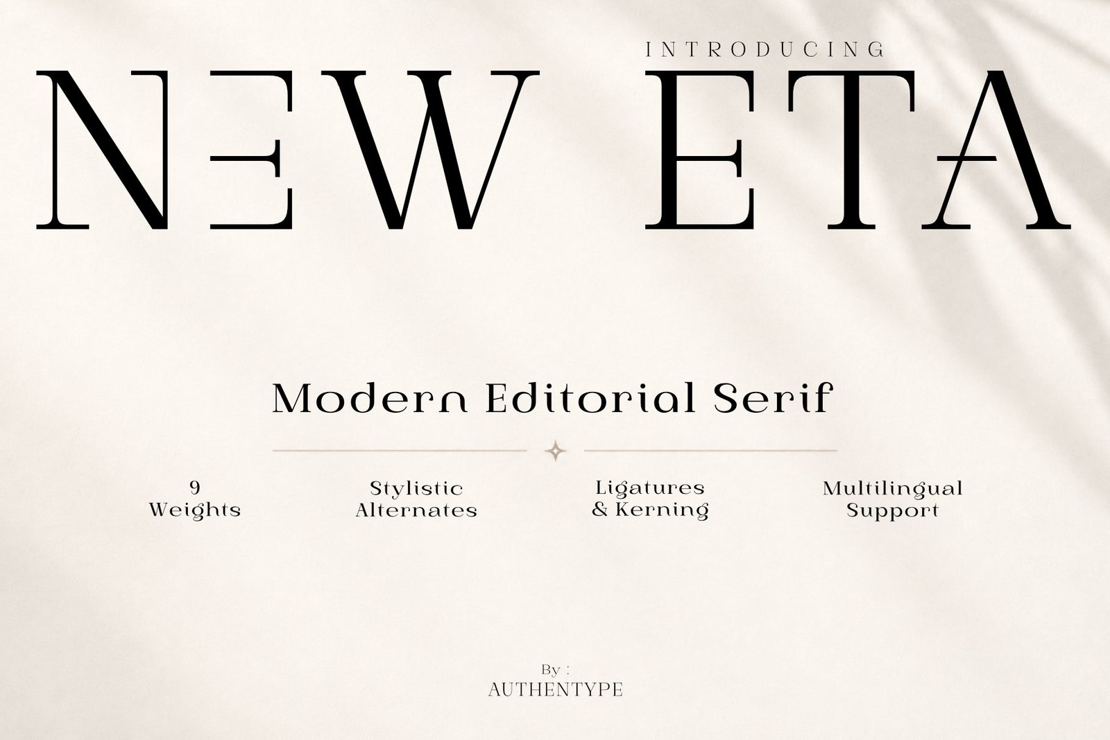
The bottle looks good. Six letters sit across the label, the light catches the glass, and there is enough empty space to make almost any confident typeface feel expensive.
Then someone asks for a mobile banner with the full campaign headline.
That is a more useful moment to judge the font. A short brand name tells you very little about how a typeface will handle a sentence, a small product image, or a layout that has to accommodate a price and a button. If you are deciding how to choose a display font, bring those less flattering conditions into the process early.
Consider a fictional skincare brand called SOLARA. We will use it as a working example, not a completed client project or a measured font comparison. The brief calls for an editorial feel, with product photography doing much of the talking. The typography needs to work on a serum bottle, a website heading, and a launch announcement.
The brand name is the easy part
SOLARA gives you six capitals and a compact piece of copy. It is tempting to spend the entire selection process arranging those letters, especially once you find an attractive S or R. But the launch also needs the sentence “Everyday care, without the extra steps.” That sentence deserves a place beside the name from the start.
Set both in two or three candidate fonts. Add “Daily Face Serum / 30 ml / No. 02” beneath them. Keep the first comparison plain: dark lettering, a light background, no embossing or shadows.
Each line exposes something different. In the name, look at the spaces around the diagonals and the open area beside the L. In the headline, watch the rhythm of the lowercase letters and where the words naturally break. The product line gives you numerals, a slash, and punctuation to inspect.
You are not looking for every line to work in the same style or size. You are finding out which jobs the display font can reasonably carry. Display type is intended for prominent, usually short text; it can take many forms, as Fontfabric’s introduction to display fonts explains. There is no obligation to make the same expressive lettering handle the small instructions on the back of the bottle.
Give the long headline somewhere difficult to fit
For SOLARA, put the campaign sentence beside a bottle image in a wide website layout. Then make a narrow version with the image, headline, short explanation, and purchase button stacked vertically. Use the same words in both.
Suppose the heading takes four lines on the narrow version and pushes the explanation much farther down than intended. That is a layout problem worth examining, but four lines alone do not prove that the font is wrong. Read the breaks first. Does “extra steps” stay together? Does the final line look stranded? Is the heading still the first thing you notice?
Try a modest size change and a different text width. If you are building a website, check nearby viewport widths too: a line break that looks deliberate in one screenshot may become awkward when the available space changes.
If the heading only fits after shrinking until it looks like supporting copy, compare a font with narrower proportions. Compressing the lettering horizontally may fit the box, but it also changes the shapes that attracted you to the font in the first place.
This is why the long sentence belongs in the selection process. It can reveal a mismatch before the bottle mockup makes you reluctant to change direction.
“Editorial” needs to mean something on the page
For this particular brief, an editorial direction might mean an expressive serif headline, a restrained product description, and enough room around the photograph for the composition to feel unhurried. Those are decisions you can see. “Premium” on its own gives you much less to work with.
New Eta would be a reasonable candidate to explore here. Its high-contrast serif design and fashion-influenced character relate to the brief. That makes it worth testing; it does not settle the choice.
Place the headline on the actual background you expect to use. If fine strokes become difficult to distinguish over a highlight in the photograph, try moving the text to a clearer area before changing the font. Then compare another weight. A family with nine weights gives you room to investigate, although each choice still needs to work at the final viewing size.
A different brief could lead elsewhere. If SOLARA were positioned around technical performance, with angular packaging graphics and a more assertive campaign, Kinetix Luxe would offer a mechanical, futuristic direction to explore. Its relevance would come from that change in the brief. It would not be an interchangeable substitute for the same quiet editorial layout.
Let the small text do its own job
Now add a short product description and a “Shop the serum” button. The heading has company, and the font decision may look different.
If the product name, headline, price, and button all have equally strong personalities, the reader has to work out what matters first. Keep the expressive treatment where it earns its space. For SOLARA, that might be the campaign headline, while a quieter text face handles the explanation and purchase details.
Read the whole composition rather than evaluating the font pairing as two isolated alphabet samples. Can you find the product name quickly? Does the explanation feel comfortably readable? Is the button easy to locate without making it as large as the heading?
Size, space, alignment, and typeface choice all contribute to that order, a relationship covered in Figma’s typography guide. Change one at a time when something feels wrong. Switching fonts immediately can leave the underlying spacing or hierarchy problem untouched.
Fix a gap, then check the next word
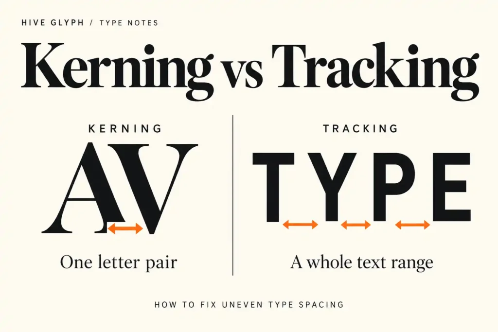
Return to SOLARA in capitals. Start with the font’s default spacing and kerning enabled in your application. Look at the white spaces as part of the word: a gap beside a diagonal can appear different from one between upright strokes, even when their measured distances seem similar.
If one pair feels loose, adjust that pair and look again at the whole name. Tightening the tracking across all six letters changes the gaps that may already be working.
A fixed wordmark can justify this attention. A campaign with new headlines every week needs to be easier to maintain. After refining the name, set a second product name and another sentence without carrying over its individual spacing adjustments. See how much intervention they need.
If every line takes substantial repair, factor that time into the choice. The person producing next month’s launch materials may not be the designer who prepared the original mockup.
Make the decision with the ordinary version open
By now, the SOLARA comparison should include a label, a narrow layout, a long headline, and supporting copy. Keep the least forgiving version on screen when choosing between the final candidates. It will tell you more than another polished presentation image.
Before buying, confirm the characters and languages the project needs, the styles included in the selected package, and the license terms for the intended use. If you are purchasing for a specific application, check the font there using any permitted trial or preview options available. Do not assume that a feature shown in a specimen will be accessible in every design tool.
Save the selected layouts with the style names and spacing decisions. Note which treatments belong only to the wordmark and which can be reused for campaign headings.
For SOLARA, the choice is ready when the longer sentence sits comfortably beside the product, the small information remains clear, and a new headline does not require rebuilding the design. The bottle can still have its beautiful mockup. You will also know what happens after it.
[…] you have not chosen the headline face yet, our guide to choosing a display font for headlines and branding covers that earlier step. Here, assume the title already has a direction you want to […]
[…] the visual choice itself remains uncertain, our guide to choosing a display font can help you evaluate the design. Buying a license should follow a considered choice, not […]
[…] typography overwhelms the supporting information, our guide to choosing a display font offers a separate check on the visual choice. File editability will not rescue a hierarchy that […]