Fonts for Fashion Brands: Test Labels and Tags
 Written by HiveGlyph
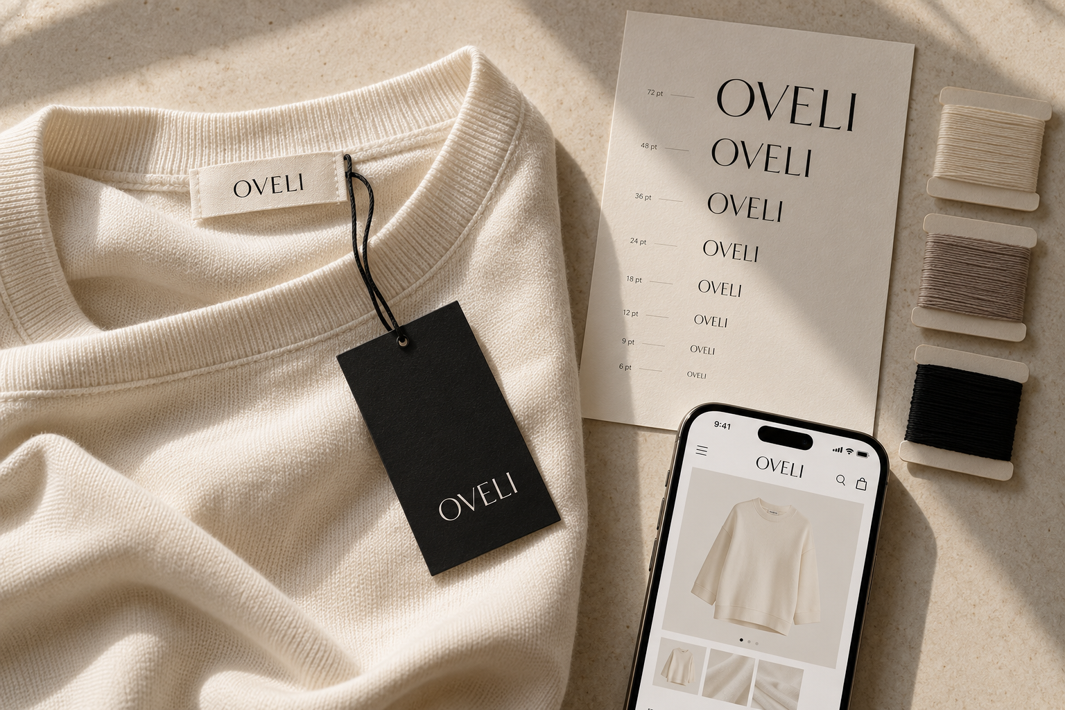
Fonts for Fashion Brands: Test Them on the Garment, Not Just the Mood Board
A fashion wordmark can look beautifully controlled across a full-screen campaign image. Then it is reduced for a narrow woven label and the elegant hairlines begin to disappear. The spacing closes during embroidery. A distinctive alternate becomes difficult to recognize on a size tab. On the website, the same name occupies so much horizontal space that the mobile header has nowhere left to breathe.
The font may still be right for the brand. The problem is that it was approved in its most flattering setting.
Choosing fonts for fashion brands requires more than comparing logos on a mood board. The type has to move between fabric, paper, packaging, photography, and screens while keeping enough of its character to remain recognizable. That does not mean every application needs an identical piece of artwork. It means the identity needs a controlled way to adapt.
List the real touchpoints before judging a font
Begin with the places where customers will actually encounter the name. For a clothing label, that list may include:
- The primary wordmark
- A woven neck label
- A small exterior tab
- Embroidery on a cap, shirt, or bag
- A printed care or composition label
- A hangtag
- A garment bag, box, or mailer
- An ecommerce header
- Product thumbnails and social avatars
- Size, collection, and product-line identifiers
These applications ask different things of typography. A campaign masthead can use fine contrast and generous spacing because it has room. A woven tab may have only a short brand name and a few millimetres of usable height. A care label contains dense functional information that must survive wear and washing.
Do not choose one attractive sample and assume it represents all these conditions. Set the actual text for several touchpoints before approving the direction.
Separate the brand label from the information label
The main label and the care label belong to the same garment, but they do not have the same job.
A brand label creates recognition. It may contain only the wordmark, symbol, or collection name. This is where a more expressive serif, customized wordmark, or carefully spaced display face can earn its place.
The information label carries composition, origin, care instructions, sizing, and business identification. In the United States, the FTC says most textile and wool products require labels identifying fiber content, country of origin, and the manufacturer or another responsible business. Care instructions are covered by a separate rule. Requirements vary by product and market, so this is a production and legal check rather than a universal template. Review the current FTC textile labeling guidance and the rules for every country in which the garment will be sold. Federal Trade Commission
The FTC’s U.S. care-label guidance also says covered labels must be attached securely and remain legible through the useful life of the product. If packaging prevents shoppers from finding the information, additional care information may need to appear outside the package or on a hangtag. Federal Trade Commission
This makes a practical typographic distinction clear. The expressive font does not have to carry every warning, percentage, and washing instruction. Give the information label a typeface with clear figures, punctuation, capitals, and small-size spacing. The two faces should feel compatible, but they can solve different problems.
Test the production method, not just the dimensions
Reducing a logo to the correct physical width is necessary, though it does not reproduce the behaviour of thread, ink, or woven yarn.
A thin diagonal may look intact in a vector preview and become uneven when stitched. A narrow counter may fill when the mark is woven. Closely spaced letters may merge when ink spreads on a textured stock. Reversed lettering can appear heavier than the same shapes printed in a dark color on white.
There is no useful universal minimum stroke width for every supplier. Woven density, thread, fabric, embroidery equipment, ink, and finishing all affect the result. Ask the manufacturer for:
- The recommended minimum letter height
- The minimum line and gap they can reproduce reliably
- Accepted artwork formats
- Color limitations
- Whether they can supply a physical sample
- Examples produced with comparable detail
Treat those answers as specifications for that supplier and process. If production moves elsewhere, repeat the check.
A rendered mockup can explain placement, but it cannot prove that the label will manufacture cleanly. The proof is a production sample viewed at its real size.
Build a reduction sheet before requesting samples
A simple reduction sheet exposes weak choices before you pay for sampling. Place the identity on one page in the conditions it must survive.
Include the wordmark at its large campaign size, expected hangtag size, woven-label size, and the smallest digital use. Add black-on-white and white-on-black versions. Then include a one-color version and a deliberately ordinary product name, such as “Relaxed Merino Cardigan,” beneath the mark.
Inspect the sheet at 100 percent. Avoid enlarging the smallest versions while judging them.
| What you notice | Likely cause | Useful response |
|---|---|---|
| Hairlines fade first | Contrast is too delicate for the output | Test a sturdier weight or small-size master |
| Counters begin to close | Interior spaces are too small | Increase size, simplify the form, or change style |
| The name becomes one dark strip | Weight and spacing are too dense | Open selected pairs or compare a lighter weight |
| Individual letters survive but the word is slow to read | Distinctive forms interrupt recognition | Reduce alternates or simplify the wordmark |
| The logo works but the care copy does not | One face is being asked to perform incompatible roles | Assign a dedicated information typeface |
| The mobile header becomes crowded | The wordmark is too wide for the placement | Use a compact lockup or approved symbol |
This sheet is a diagnostic tool. It does not replace physical output, but it tells you which versions deserve a sample.
Create a controlled small-size version when scaling is not enough
A small-size logo does not always need to be a mathematically identical reduction.
You may need to strengthen delicate strokes, remove a swash, open a narrow gap, or slightly loosen a pair that closes on fabric. If the full wordmark includes a fine subtitle, the small version may omit it. These changes should preserve the recognizable structure of the mark instead of becoming an unrelated redesign.
Document each approved version by purpose:
- Primary wordmark for campaigns and large packaging
- Small wordmark for labels and compact digital placements
- One-color production version
- Embroidery version
- Symbol-only version for highly constrained spaces
Name the files clearly. “Logo-final-small-new-2” does not tell a supplier which artwork is approved for stitching.
The same principle applies to digital exports. If the mark loses clarity in a small website header, review the artwork and its occupied canvas before blaming the file format. The Hive Glyph guide to fixing blurry logos at small sizes provides a focused digital checklist.
Check the letters that the brand will actually use
A fashion identity is rarely limited to the brand name. It may need collection titles, garment categories, prices, sizes, material percentages, product codes, and campaign copy.
Test a candidate with realistic text such as:
- Autumn/Winter 2027
- Atelier Collection No. 04
- XS–XXL
- 72% wool, 28% recycled polyamide
- Made in Indonesia
- Dry clean only
- Limited edition
- Relaxed-fit double-breasted coat
Look closely at the numerals, percent sign, slash, ampersand, and punctuation. Check the distinction between similar characters, especially uppercase I, lowercase l, and the numeral 1. A striking alphabet preview does not tell you how confidently the family handles product data.
If the brand will sell across languages, insert approved translations and actual place names during testing. Confirm the font’s character coverage rather than substituting characters from another family at the end. The guide to multilingual campaign layouts covers the layout problems that appear when translated text expands.
Choose weights by application, not prestige
Thin typography is often associated with luxury fashion, but a thin style is not automatically the most refined choice. Its success depends on size, substrate, contrast, and production.
A family with several weights gives you room to keep a consistent typographic voice while adapting it. The label might need Medium while the campaign uses Light. Product names could use Regular, with SemiBold reserved for sizes or ecommerce controls. These differences are functional, and they can be subtle.
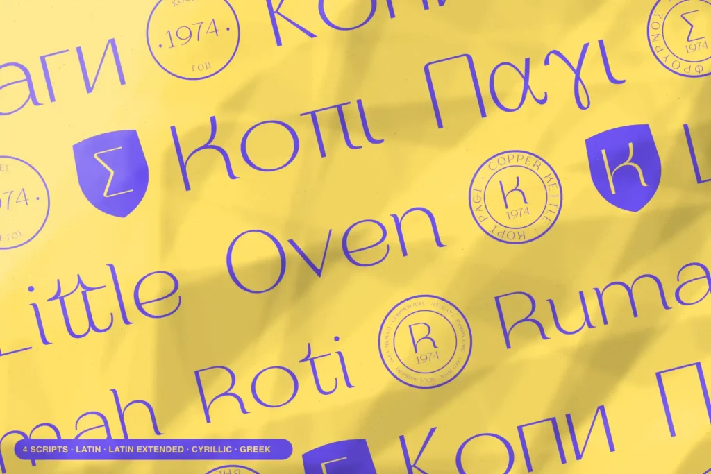
Poppis is one candidate to evaluate when a fashion identity needs a geometric sans-serif family rather than a single display style. The current product page lists nine weights from Thin through Black, along with Latin, Cyrillic, and Greek coverage. That range makes it possible to compare delicate campaign typography with sturdier label and interface settings inside one family. It does not guarantee that every weight will weave or embroider successfully, so the physical tests still apply. Hive Glyph
If you are deciding whether that flexibility justifies a complete family, use the role-mapping method in Font Family vs Single Style. A fixed wordmark may need only one carefully prepared style. A continuing fashion system often needs more.
Give the hangtag a hierarchy of its own
A hangtag has more space than a neck label, but it can easily become crowded. The front may carry the wordmark, while the reverse includes a product story, size, price, barcode, website, certification statement, or material note.
Start with the information that must be scanned quickly. Product name, size, and price should not compete with a decorative collection title. If a sustainability or material statement is included, confirm the wording with the responsible business team before designing around it.
Use the expressive type for one clear role. Let a quieter supporting face handle variable information. This keeps the tag recognizable as part of the identity without turning every line into a miniature advertisement.
Under U.S. FTC guidance, a hangtag that mentions a fiber without disclosing the complete fiber content may need to direct the shopper to the full product label. That is another reason to finalize approved copy before adjusting the composition. Federal Trade Commission
Compare the physical identity with the ecommerce version
The garment and the product page should feel related, but they are viewed under different conditions.
On a physical label, texture and production may soften the letterforms. On a phone, the problem is limited width and rasterization. A widely spaced fashion wordmark may look calm on a desktop and force the navigation into an awkward second row on mobile.
Test the ecommerce version in a working header with the menu, search, account, and cart controls present. Add a typical product thumbnail and price. Then compare it with the woven sample and hangtag.
The goal is not pixel-for-thread similarity. Look for the features that create recognition: overall word shape, proportions, a distinctive terminal, the treatment of one repeated letter, or the relationship between the name and symbol. Those features should survive even when the artwork changes for its medium.
Approve a system, not a single beauty shot
Before releasing the identity, assemble one approval board that includes:
- The primary wordmark
- The smallest approved wordmark
- A woven-label sample
- An embroidery sample when relevant
- A printed hangtag at actual size
- A one-color and reversed version
- A care-label typography sample
- A desktop ecommerce header
- A mobile header
- A product thumbnail or social avatar
Mark each item with its dimensions and intended process. Record which sample came from which supplier.
A fashion typeface earns its place when it can keep the brand recognizable across these conditions. The elegant campaign image is still important. It simply should not be the only place where the identity is asked to work.