How to Build a Typography Mockup Without Distorting the Typeface
A polished mockup can still misrepresent a typeface when perspective, texture, or scaling changes the letterforms. Use this workflow to keep the presentation realistic and honest.
 Written by HiveGlyph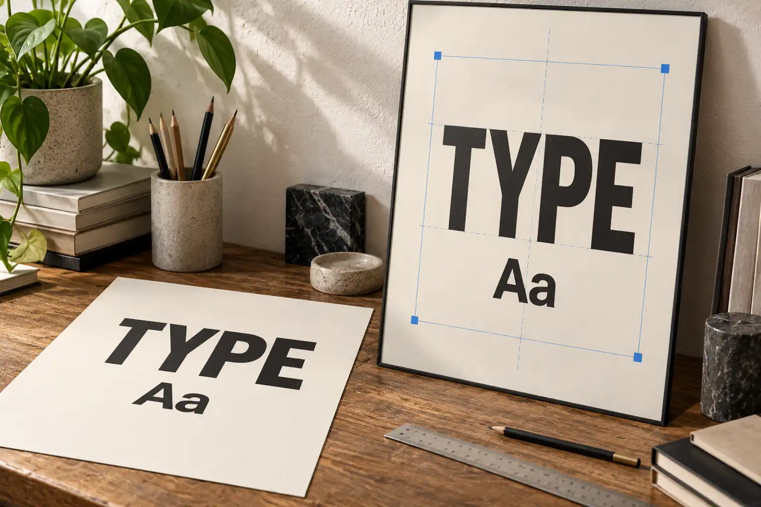
A typography mockup has two jobs. It should make the design feel plausible, and it should show the lettering faithfully. Those aims can pull in different directions.
A poster angled against a wall may look more convincing after a strong perspective transform. Paper grain and soft shadows can help a label sit inside a photograph. Yet the same effects can squeeze round letters, thicken one side of a stem, or make a clean curve look damaged. The scene gains realism while the typeface becomes less truthful.
The solution is not to remove every effect. It is to separate the geometry of the artwork from the appearance of the surface, then judge each change against an untouched reference. The following workflow works for posters, packaging, stationery, screens, and other flat or nearly flat applications.
Begin with a flat master
Keep one version of the artwork that has no perspective, surface texture, highlight, or shadow. Text can remain live while you work, or you can retain a duplicate editable layer before creating outlines for a particular production step. The important part is having a dependable source that has not been reshaped to fit the photograph.
Set the flat master to the intended proportions of the printed or displayed area. If the frame is A3, the artwork should use the A-series ratio. If a label is 90 × 50 mm, build the label at that ratio before placing it into the scene. This avoids an easy mistake: forcing a nearly correct rectangle into the available space and quietly changing the type along with it.
Export or place this master as a single replaceable object, but keep the editable source separately. Add a temporary reference copy above the mockup when reviewing the result. Switching between the flat and transformed versions makes distortion easier to see than judging the mockup by itself.
Match the plane before adding texture
Find the physical plane that will hold the artwork. On a poster frame, its useful boundaries are usually the four inside corners. On a box, work on one face at a time. On a folded card, each panel needs its own plane because the angle changes at the fold.
For a genuinely flat surface, use a four-corner perspective placement or a perspective tool. Adobe’s current Perspective Warp documentation recommends defining planes by drawing quads along the surface and aligning their edges with straight lines in the image. That is a better starting point than pulling arbitrary warp handles until the composition seems to fit.
Check the structural lines around the artwork. Its top and bottom edges should follow the same vanishing direction as the frame or package face. Vertical edges should agree with nearby verticals unless lens distortion is visibly bending the whole photograph.
Do not use a curved warp to solve a planar perspective problem. Warp is useful when artwork wraps around a bottle or follows cloth, but it can bow horizontal strokes and alter counters on a flat poster. Choose the transform that describes the object you are showing.
Protect the typeface proportions
Nonuniform scaling is the quickest way to make a font look like a different design. Dragging only the side handle narrows every glyph. Dragging only the top handle changes apparent weight and compresses the rhythm between baselines. Because all letters change together, the error can feel surprisingly tidy.
Use proportional scaling while preparing the flat artwork. Let the later perspective transform account for the way the plane recedes in the photograph. If the composition still does not fit, resize the entire printed area, crop the artwork deliberately, or revise the layout. Do not squeeze the wordmark merely to occupy the available rectangle.
Several shapes reveal unwanted distortion quickly. Compare a round letter such as O with the flat master. Look at the width of repeated vertical stems in H, N, or M. Check whether a diagonal becomes unusually heavy after rotation and resampling. In lowercase text, compare counters in e, a, and p. These checks are more reliable than asking whether the whole scene simply “looks right.”
Keep the artwork replaceable
A replaceable object turns the mockup into a working template rather than a one-off composite. In Photoshop, a Smart Object lets you edit or replace its contents and reset transforms. Adobe documents the relevant commands in its guide to creating and managing embedded Smart Objects.
The same principle applies in other software. Keep the source artwork separate, apply perspective and surface effects outside that source, and avoid repeatedly rasterizing transformed copies. Repeated resampling can soften thin details and makes later corrections harder to trace.
Name the layers by purpose. “Artwork master,” “perspective,” “surface shadow,” and “paper texture” are more useful than a stack of copies. When another designer opens the file, the division between design and presentation should be obvious.
Let texture follow the material
Texture should explain the surface, not decorate every letter. Fine paper may need little more than slight tonal variation. Coated packaging might show a controlled highlight but very little fibre. A fabric tote can justify visible weave and gentle displacement because the ink follows an uneven material.
Displacement maps can move pixels according to the values in another image. Adobe notes that its Displace filter can make an image appear printed on material such as cloth. Use the effect at the scale of the actual surface. A low-resolution texture enlarged across a large poster can create waves that do not belong to the photographed object.
Compare the effect with nearby details. If the type bends sharply but the seams, fibres, and highlights remain straight, the composite contradicts itself. Reduce the displacement or improve the map. Small changes usually communicate the material more convincingly than a dramatic filter.
Texture can also create false defects in a type specimen. A broken hairline or filled counter may be interpreted as part of the font. If the purpose is to present the typeface, include at least one clear view or crop where the letterforms remain easy to inspect.
Match light without inventing strokes
Artwork placed into a photograph should share its surroundings. Adjust black and white points so the printed area does not look pasted on. Add the same softness, grain, and restrained colour cast seen in nearby surfaces. If the photograph is slightly out of focus, perfectly sharp type will feel detached from it.
Build highlights and shadows from the material. A frame glass reflection may cross the whole poster, while a fold shadow should continue across both the printed colour and the letters. Avoid painting a separate dark edge around the type unless the real printing method would produce one. Such edges can make stems appear heavier and change the apparent spacing.
Watch contrast at thumbnail size. A realistic highlight that wipes out half the headline may work as an atmospheric campaign image, but it is a poor primary font preview. Presentation context does not excuse hiding the feature being presented.
Review the mockup at more than one scale
First inspect the image closely. Look for warped corners, jagged diagonals, texture masks spilling outside the print area, and highlights that stop at layer boundaries. Then reduce the image to the size at which it will appear on a product page, portfolio grid, or social post.
The smaller view reveals a different set of problems. Fine text may disappear, a shadow may merge with a letter, and the intended hierarchy may collapse. If the design is for physical packaging, a mockup cannot replace a print test. The workflow in How to Test Packaging Typography at Actual Size explains why viewing distance, folds, and real output size still need their own proof.
Finally, toggle off the effects and compare the result with the flat master. The context may change how the design feels. It should not silently redraw the alphabet.
A dependable order of operations
- Prepare an untouched flat master at the correct aspect ratio.
- Place it as a replaceable object without stretching its width or height independently.
- Define the receiving plane from the photograph’s real edges.
- Apply perspective to match that plane.
- Add material texture and displacement at a restrained, believable scale.
- Match lighting, sharpness, grain, and colour to the photograph.
- Compare with the flat master at full size and at the final display size.
- Keep both the editable artwork and the presentation file for handoff.
Common symptoms and useful fixes
| What you see | Likely cause | Better response |
|---|---|---|
| Round letters look narrow | The artwork was scaled horizontally before placement | Return to the flat master and resize proportionally |
| Strokes bend on a flat poster | A freeform warp was used instead of planar perspective | Rebuild the placement from the four surface corners |
| Fine details look broken | Displacement or texture is too strong | Reduce the effect and compare it with the surface detail |
| Type looks sharper than the scene | The artwork does not share the photograph’s focus and grain | Match softness and grain after perspective is correct |
| Future edits damage quality | The placed artwork was rasterized too early | Keep a replaceable source object and resettable transforms |
Hand off the truth and the context
A useful presentation package contains both. The flat artwork shows what the typography actually is, while the mockup shows how it might behave in a setting. Label them clearly so a client or collaborator does not mistake the atmospheric version for production artwork.
Keep text or vector sources available when the agreement allows it, and document any linked images or effects required to update the scene. The checklist in Editable Design Files: What to Check Before Client Handoff covers the wider file-preparation questions.
The strongest typography mockup is not the one with the most visible effects. It is the one where the surface feels credible, the hierarchy still reads, and the typeface remains recognisably itself.